Passafund
Judging a borrower on more than a credit score
A personality assessment feature for a peer-to-peer lending startup, designed to give lenders insight into borrowers that financial history alone does not carry.
- Role
- UI/UX Designer, sole designer on the feature
- Team
- Solo
- Timeline
- Internship, 2025
- Tools
- Figma
- Context
- Passafund, a peer-to-peer lending startup
The short version
The problem
In peer-to-peer lending a credit score is the whole picture, and it is a thin one. Lenders wanted some read on whether a borrower would actually follow through, and financial history alone does not answer that.
What I did
I designed the personality assessment end to end during my internship, then surveyed lenders and borrowers on the existing concept and rebuilt it around what came back.
- 4
Usability findings from the concept survey
- 75%
Flagged skipped questions as not visible
- 68%
Flagged the dark blue background as confusing
- 4
Competitor assessment tools benchmarked
The trust gap
Passafund is a fintech startup working on peer-to-peer lending. In that model an ordinary person makes a call a bank makes with a whole department behind it, and on Passafund they were making it on a credit score and little else.
A credit score summarises a repayment history well. It says much less about whether someone will follow through, which is the thing a lender is actually trying to judge. Passafund wanted a behavioural signal to sit alongside the financial one.
During my internship I was responsible for the complete design of that feature: a personality assessment that gives lenders insight into a borrower without pretending to replace the credit score.
Three ways this could go wrong
A personality test attached to a lending decision is a feature that can do real harm if it is designed carelessly. I set the constraints before drawing any screens.
Bias in lending decisions
Results are framed objectively, avoiding loaded labels, and focus on actionable insight that complements financial data rather than replacing it.
Privacy concerns
Clear communication about how the data is used, and an explicit statement that the assessment is for lender insight only and never visible to other borrowers.
Complexity of assessment
Intuitive interface, plain language and a streamlined flow, so the assessment does not become a hurdle that borrowers abandon.
Who else tried this
To understand the landscape I analysed several existing personality and financial assessments, looking for best practices and for the gap Passafund could occupy.
Sun Life
Educational, aimed at financial literacy. No integration into lending decisions, so it serves self-awareness rather than a lending judgment.
Discover
Self-awareness and personal financial growth. Like Sun Life, it is built for personal insight, not lender assessment.
TD Wealth
Maps financial decision-making styles to support advisor conversations. Advisory-focused rather than linked to a lending decision.
Lenddo
Uses alternative external data, social media and online behaviour, for creditworthiness where traditional systems are thin. Passafund's assessment is more introspective, evaluating traits that shape financial behaviour.
Plenty of financial personality quizzes exist. None are wired into a lending decision the way Passafund intended. That was the opportunity, and also the warning: an assessment nobody else attempts in this context needs to be read as an objective tool rather than a subjective hurdle.
What the survey said
I built a survey and sent it to potential users, both lenders and borrowers, who had used a preliminary prototype of the assessment. The goal was to find out how the existing concept was actually landing.
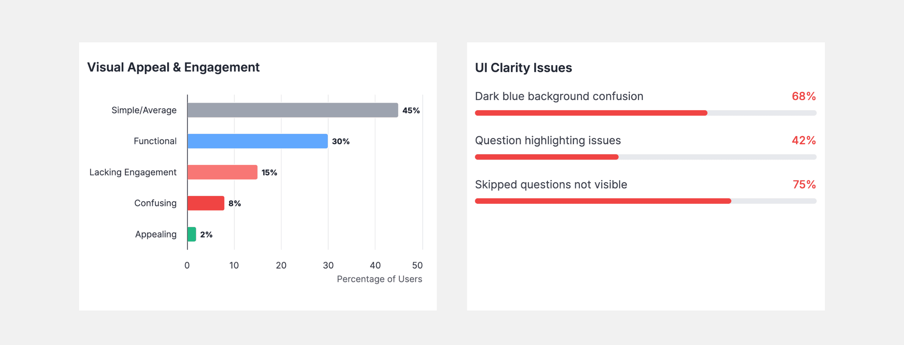
The dark blue background caused confusion
What changed
Selection feedback rebuilt for consistency, so choosing an answer reads as confirmation rather than a state change the user has to interpret.
What we saw
Multiple users said the dark blue background applied after selecting an answer made the interface feel unclear or inconsistent. The visual feedback for a selected answer was doing the opposite of its job.
“Multiple users mentioned that the dark blue background after selecting an answer made the interface feel unclear or inconsistent.”
Survey synthesis
Progress tracking left people unsure how much was left
What changed
A clearer progress indicator with concrete numbers rather than an abstract bar, so the remaining effort is always legible.
What we saw
Users could not tell how many questions remained. In an assessment people are already reluctant to start, not knowing the length is a reason to abandon it.
“The progress indicator needs to be more visible and provide concrete numerical context.”
Survey synthesis
Question highlighting helped and hurt at once
What changed
Highlighting logic refined so it guides attention without fighting the user, and skipped questions are surfaced clearly enough to return to.
What we saw
The highlighting feature was called out positively for drawing attention, and negatively for being annoying when skipping between questions. Three quarters of respondents said skipped questions were not visible enough.
“Annoying when skipping between questions.”
Survey respondent
Walking the borrower's path
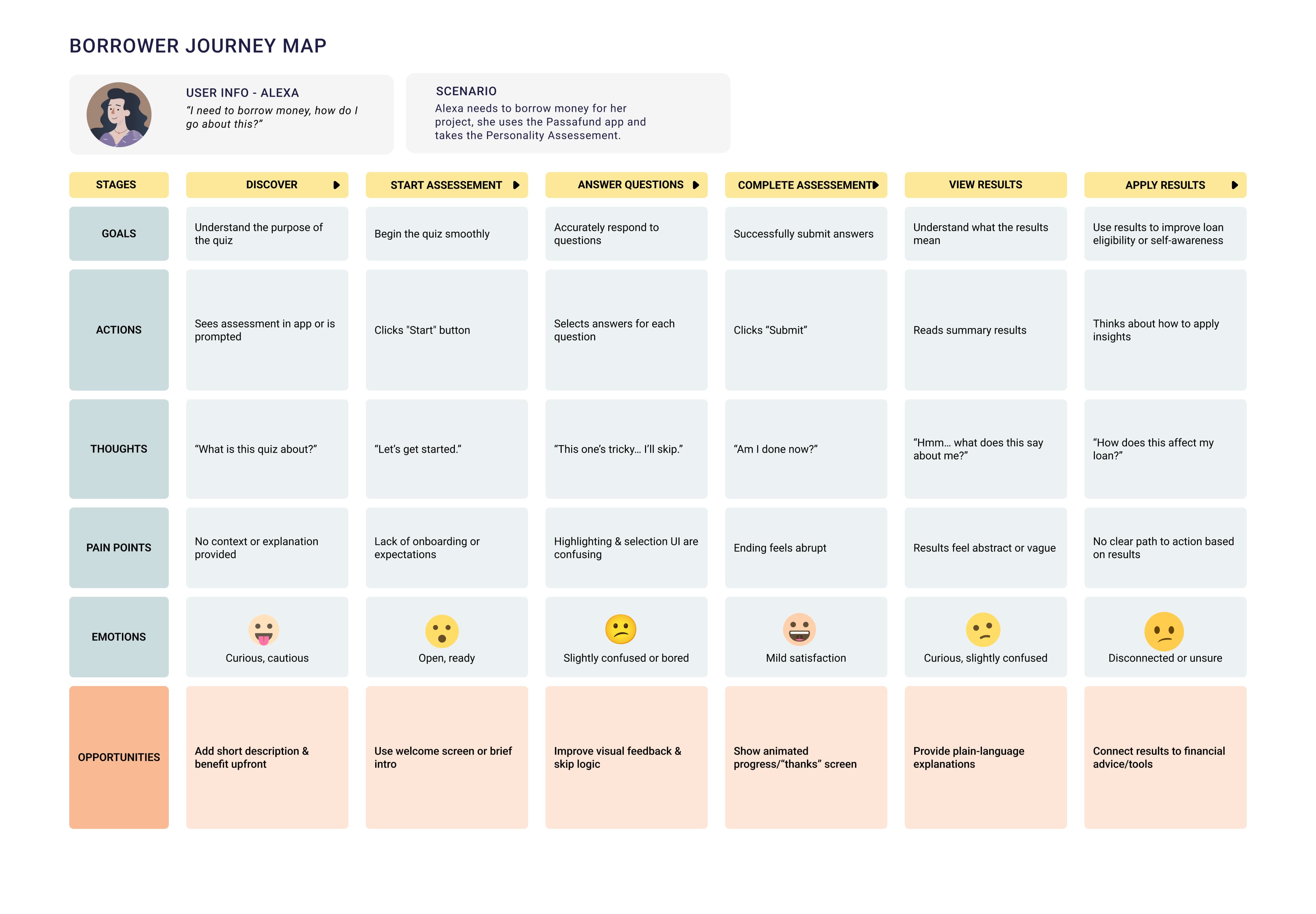
The user journey focused on borrowers completing the assessment, concentrating on the interactions that mattered most: question selection, visual feedback and progress tracking.
Launch
1 of 6
What fintech design taught me
Proactive risk mitigation. Identifying bias and privacy concerns early, before any screens existed, is what kept this from becoming a feature that quietly penalised people. On a sensitive product that work has to come first.
Small UI issues are not small. A background colour on a selected answer was enough to make the whole interface read as inconsistent. The survey caught something I would not have predicted from the design alone.
Business goals run through user comfort. The feature's purpose was increasing lender confidence, but the only route to it was a borrower finishing an assessment they found clear and fair. Serving one meant serving the other.
Where it would go next
Another round of usability testing on the refined design, to validate the changes and find what the first survey could not. Beyond that: A/B testing the visual treatment and wording against completion rates, a feedback loop with lenders on whether the results actually change their decisions, and monitoring completion rates against lending outcomes.
The honest state of this one is that the redesign answered the survey, and the survey is all the evidence there is so far.