SHARP Imaging Labs
Bringing adaptive optics out of the command line
Redesigning pyRTC, an open-source astronomy real-time controller, into a unified dashboard a junior researcher can run on day one.
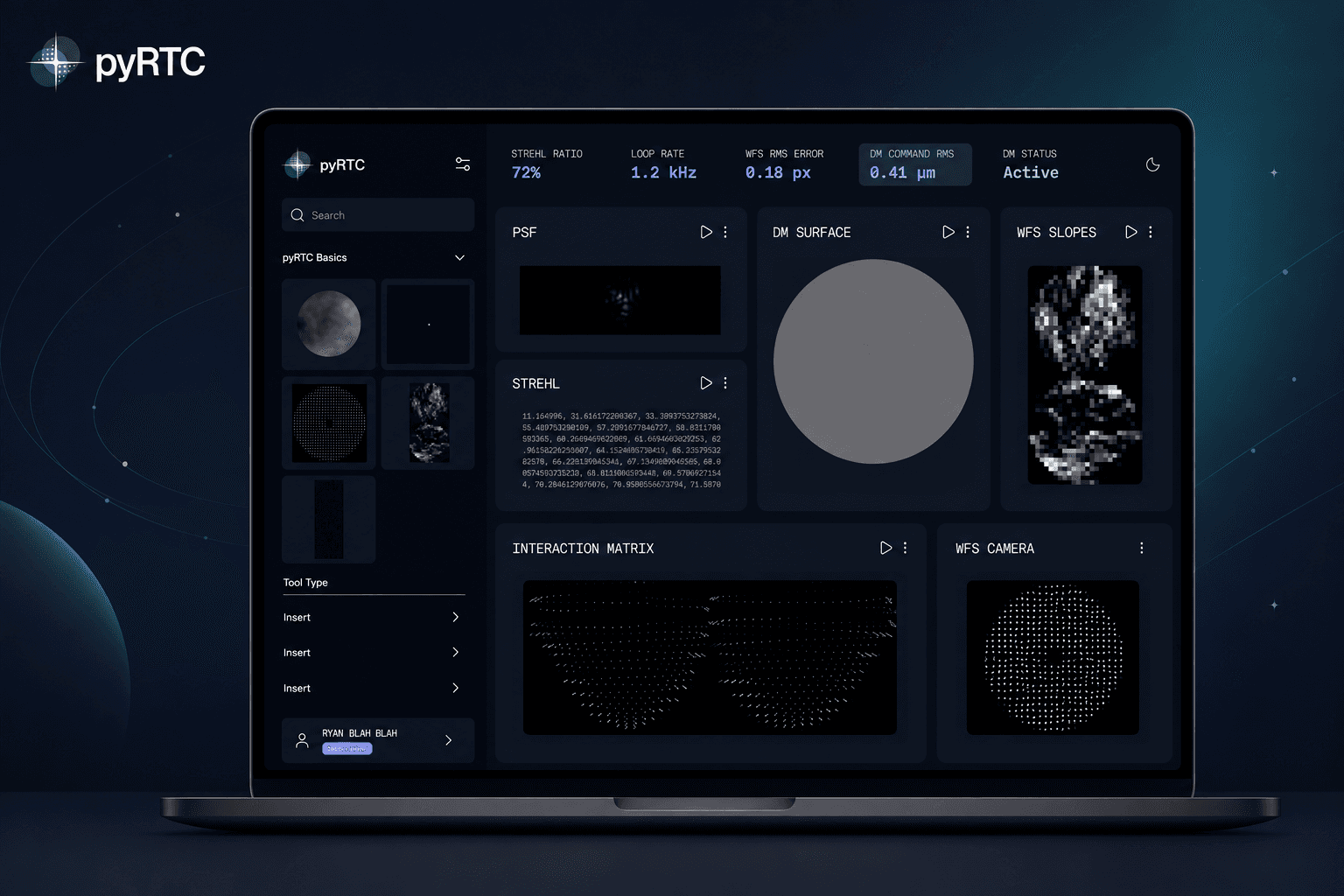
- Role
- UX Designer and Researcher
- Team
- Team of 4
- Timeline
- 14 weeks, Jan to Apr 2026
- Tools
- Figma, Tailwind, Lucide
- Context
- UX capstone, client project with SHARP Imaging Labs, University of Toronto
The short version
The problem
pyRTC runs entirely in a terminal, spread across four separate windows, with almost no documentation. The only way to learn it is from someone who already knows it, so when that person leaves, the knowledge leaves too.
What I did
I worked on the design, created the design system for the open-source handoff, and ran interviews with adaptive optics researchers.
- 4 → 1
Fragmented viewer windows collapsed into one workspace
- 0 → 5
Onboarding steps for first-time users, from none
- 4
Usability findings shipped as design iterations
- 1
Design system for open-source handoff
What pyRTC is, and who it is for
Adaptive optics is how ground-based telescopes cancel atmospheric distortion in real time. A real-time controller is the software running that closed loop, measuring the wavefront and reshaping a deformable mirror thousands of times a second.
Most controllers in the field are written in low-level C, locked to expensive hardware bundles, and built for full-scale observatories. pyRTC is the outlier: open source, written in Python, made by U of T PhD student Jacob Taylor with Robin Swanson and Ryan Dungee. It is the only realistic learning tool for a graduate student who wants to actually run adaptive optics without buying a $200k bundle.
That accessibility is its superpower, and the existing interface hides it behind a wall of terminal commands and four disconnected plotting windows.
The brief
Modernise the pyRTC graphical interface, and lower the barrier to entry for newly admitted AO researchers.
Stakeholders
Robin Swanson as client, Jacob Taylor as creator, the grad-student developers, and the wider open-source AO community.
My part
UX designer and researcher on a team of four. I worked on the interface design, ran interviews with AO researchers, and built the design system with the team.
- 01
Discovery
Weeks 1 to 4. Lab visit, secondary research, competitive scan.
- 02
Synthesis
Weeks 5 to 7. Interviews, codebooks, affinity mapping, personas.
- 03
Ideation
Weeks 8 to 9. Low-fi flows, moodboard, logo redesign.
- 04
Mid-fi and test
Weeks 10 to 12. Clickable prototype, three usability sessions.
- 05
Iterate and hand off
Weeks 13 to 14. Hi-fi prototype, design system, final report.
Listening before designing
None of us were astronomers. Designing a real-time controller without that grounding would have produced a beautiful terminal replacement that no one in a basement lab could actually use.
So the first half of the project was about getting close to the work. Visiting the lab, watching a closed loop run on the optical table, and interviewing the people who use these systems for a living.
- 01
Field study
One hour contextual inquiry at the Dunlap Institute, observing a closed-loop demo on a vibration-isolated optical table in a 30 °C basement.
- 02
Interviews
Four semi-structured remote interviews with AO researchers at U of T, U of Hawai'i and Carnegie Science, 30 to 45 minutes each.
- 03
Competitive scan
Benchmarked four industry real-time controllers, ALPAO, CACAO, DARC and ESO SPARTA, on cost, accessibility and visual approach.
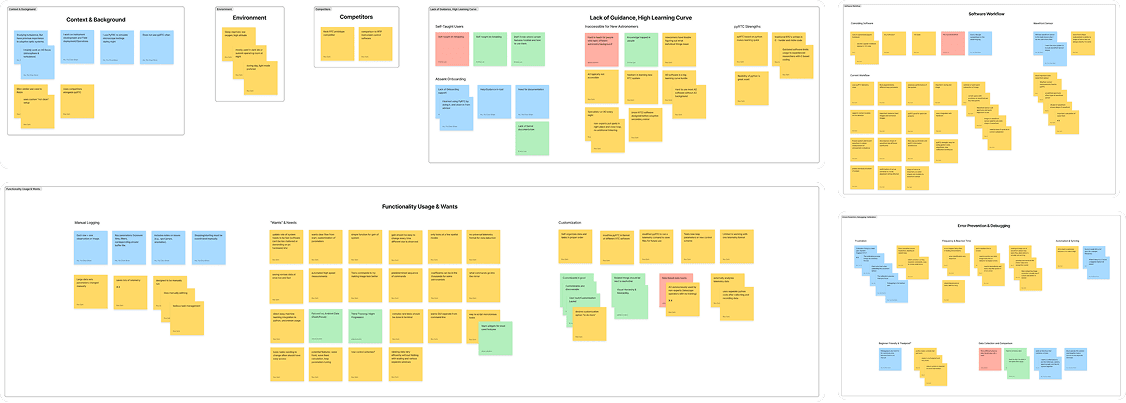
Three patterns kept surfacing
Across four interviews, every researcher, junior or senior, eventually described the same three problems in different words.
The learning curve has no railing
What changed
A guided onboarding that personalises the workspace by experience level, so a junior researcher starts somewhere safe instead of nowhere.
What we saw
There is no formal onboarding for pyRTC, or for adaptive optics in general. New users are expected to absorb decades of tribal knowledge from senior staff. When that staff retires, the knowledge leaves with them.
“Most of these systems rely on knowledge that is in the head of someone that retired.”
Software developer, Carnegie Science
Calibration burns hours that should be minutes
What changed
Per-block start and stop controls, so stopping one component no longer means stopping the system.
What we saw
Tiny config changes force a full loop restart. Telemetry filenames are typed by hand, every time. Routine work is brittle, manual and easy to break, which are exactly the wrong properties for a research tool.
“I have to restart the entire loop and shut everything down just to make a small change. It's very, very annoying.”
Postdoc, Dunlap Institute
Live data is visible but never inspectable
What changed
A single dashboard where every data block is inspectable, and clicking one reveals the code behind it.
What we saw
The current interface shows four separate windows of dots moving around. You cannot read a value, correlate sensors at the same time slice, or save a moment for review later.
“I want to view data efficiently without bringing up a bunch of separate windows and fiddling with their scalings.”
Grad student, U of Hawai'i
How might we design an interface that makes complex AO tasks simpler, so students can run experiments safely without needing an expert to guide them?
One workspace, three flows, zero terminal-only steps
Rather than redesigning the whole product, we focused on three flows that map directly to the three insights: onboarding for the learning curve, a modular dashboard for live data, and embedded docs for the knowledge gap.
A guided onboarding that respects expertise
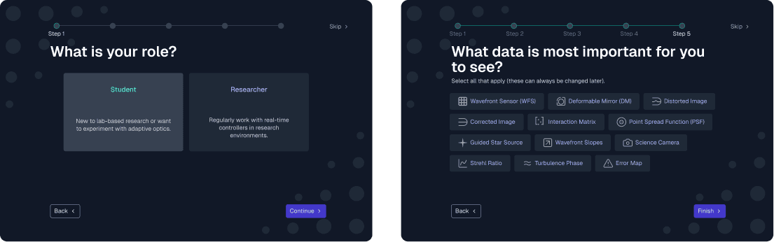
Before
No formal onboarding existed. A new researcher opened a terminal and either had a mentor beside them or did not.
After
Five short questions, role, AO familiarity, optional institutional sign-on and which data streams matter most, populate the dashboard before the user ever sees it. Junior researchers land on a beginner-safe layout. Senior researchers can skip and configure freely.
A bento-box dashboard you can actually rearrange
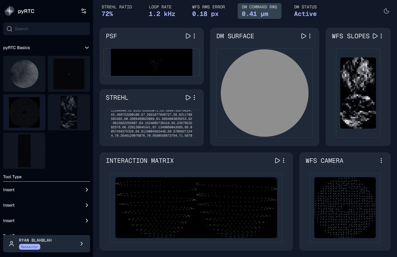
Before
Four separate viewer windows of moving dots, with no way to read a value or correlate sensors at the same time slice.
After
One drag-and-drop workspace. Drag a data block in from the left rail to add it, drag it back out to remove it. Top-bar telemetry stays visible, and clicking any block opens the live code terminal scoped to that data stream.
Documentation that lives inside the workspace
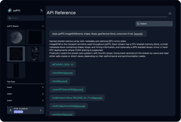
Before
Our first idea was an adaptive optics concept glossary, on the assumption that new users needed the vocabulary.
After
A test participant pointed out that pyRTC users already know AO. What they need is the API. We replaced the glossary with the project's actual function reference, searchable from any data block's overflow menu, and kept the glossary as a secondary tab.
Three sessions, four shipped fixes
We ran 25 to 46 minute moderated sessions with three participants, two returning interviewees and one new. Findings were ranked on an impact and effort matrix. Everything below was high impact and feasible within the remaining sprint.
Per-component start and stop
Testing surfaced that stopping the system is not one action but many. A camera might need a reboot while the deformable mirror keeps holding. Per-block controls now sit next to the overflow menu, with a single system-wide toggle in the header.
API reference over glossary
A domain expert flagged that pyRTC's audience already speaks AO. We swapped the glossary for the README's API content and kept the glossary as a secondary tab.
Cloud sync made optional and disclosed
Two participants pushed back on mandatory institutional login, since lab data already lives on local servers. Sign-on became optional, with explicit disclosure during onboarding and a kill switch in settings.
Visible quick menu over hover tooltip
Peer critique flagged the info-icon tooltip as an accessibility risk, since content was hidden behind hover and not keyboard-reachable. It became a visible ellipsis menu with keyboard-navigable controls.
Built for an open-source handoff
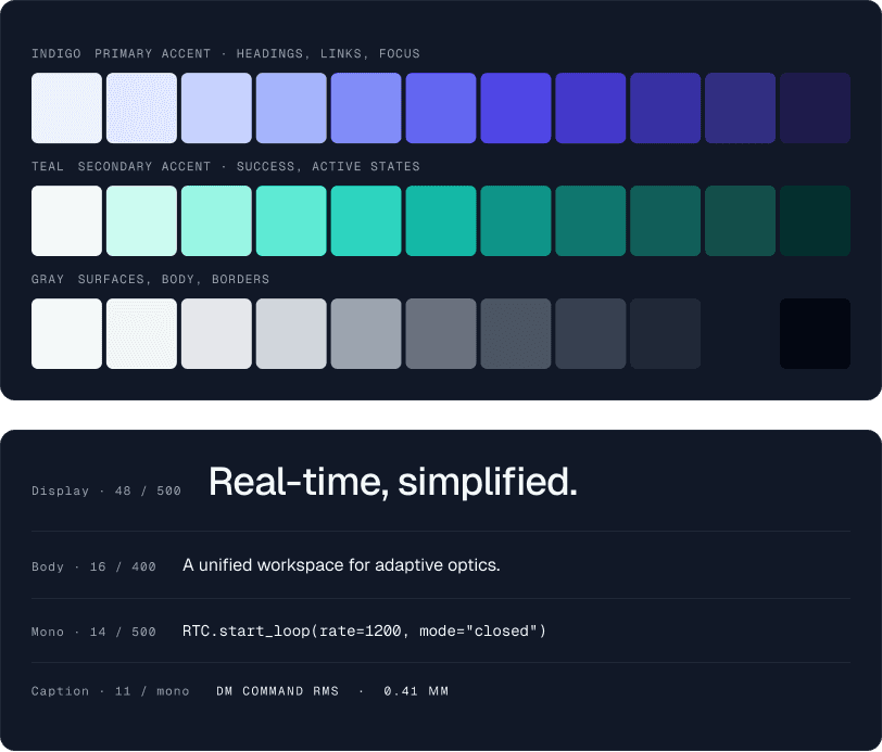
pyRTC is community maintained. Anything we shipped had to be re-implementable by a grad-student volunteer with no design tooling, so the system leans entirely on things that are free and already documented. Every variable maps cleanly to a line of CSS.
Colour, pulled from the optical-table lens
The accent palette comes from a photograph taken through a lens on the Dunlap optical table, the same indigo and teal flares that appear when light passes through stacked optics. We rebuilt them as Tailwind indigo and teal ramps so developers can reference shades by name. Indigo carries headings, links and focus; teal carries success and active states.
Type, Geist and Geist Mono
Geist for headings and body, Geist Mono for telemetry, code, and any value a researcher might read off a sensor. Both are Google Fonts, so there is no licensing friction for a volunteer picking the project up.
Components, the data block
The atomic unit of the dashboard. Built on Figma's slots beta so a developer can swap the inner visualisation, PSF, WFS, DM or Strehl, without rebuilding the chrome around it. Three states: default, focused and paused.
Icons
The Lucide library plus a handful of custom adaptive optics icons drawn to match Lucide's stroke weight, so the set reads as one family.
Where it landed
- viewer windows collapsed into a single workspace
- 4 → 1
- onboarding steps for a first-time user, from none at all
- 0 → 5
- usability findings shipped as design changes
- 4
- design system built for open-source handoff
- 1
Capstone client project. These are design and testing outcomes, not live product metrics. The prototype was handed off rather than shipped.
What I would take into the next one
Domain immersion is non-negotiable. The single biggest lift came from an hour in a 30 °C basement watching a closed loop run. None of the secondary research had prepared us for the optical-table reality: vibration isolation, dark-room observation, four laptops humming at once. The redesign that emerged was shaped by that room more than any interview transcript.
Designing for an open-source handoff changes everything. When the developers are volunteers, every opinionated design choice has to come with a re-implementable default. Tailwind, Geist and Lucide were not aesthetic picks. They were the only stack that survived the question "could a grad student rebuild this in a weekend?"
If I had another sprint, I would pair-test the API reference with a junior researcher running an actual closed loop, not a static prototype. Testing showed it was the right idea. I want to know whether jumping to a function from a block is a path users actually walk, or one we hope they walk.