Roomin
Redefining trust in roommate searching
A roommate-matching app that turns the uncertainty of searching into clarity, using compatibility scoring, real reviews, and verification.
- Role
- UX Designer and Researcher, leading a team of four
- Team
- Team of 4 designers
- Timeline
- 4 months
- Tools
- Figma, FigJam, Notion, Miro, Google Forms
- Context
- Mobile, roommate matching
The short version
The problem
Roommate platforms prioritise listings over lived experience. Profiles are vague and easy to fake, and tight move-in deadlines leave no time to vet anyone, so people commit to a year of living with a stranger on very little information.
What I did
I led design and research on a team of four, running 12 user interviews alongside a competitor audit. The synthesis became four features aimed at one problem, trust, which usability testing and expert review then pushed through four major iterations.
- 6/6
Compatibility score simplifies decision-making
- 87%
Reviews boost perceived transparency and trust
- 5/6
Expert validation of trust and transparency goals
- 4
Major iterations after testing
Why does finding a roommate feel like rolling the dice?
Roomin is a digital platform dedicated to simplifying the often daunting roommate search.
As UX Designer and Researcher I led a team of four designers to address trust and transparency issues in this space. The goal was to turn roommate selection from a risky gamble into a safer, more informed experience.
We wanted users to feel like they were choosing a roommate, not gambling on one.
The team's framing at kickoff, and the line every later decision was measured against.
- 01
Research
12 interviews, competitor audit, secondary research.
- 02
Synthesise
Affinity clustering and SWOT prioritisation.
- 03
Define
Persona, user journey, four prioritised features.
- 04
Design
Low-fi wireframes through mid-fi to hi-fi in Figma.
- 05
Test and iterate
Five second tests, journey tests, expert review.
Why the roommate search is broken today
Finding roommates today is hard because competitor platforms prioritise listings rather than lived experience, tight move-in deadlines leave little time to vet options, most apps have no real accountability or safety framework, and profiles are minimal, vague and easy to fake.
Students and young adults feel it most because they are often moving for the first time with little rental experience, budget constraints sharply limit their choices, and many rely on unmoderated platforms like Kijiji or Facebook groups.
The result: users are expected to make a big decision with very little information or support. That is the gap Roomin closes.
Listening before sketching
We ran 12 user interviews, in person and remotely, to understand concerns about the roommate search. Participants were selected for diverse experiences. The goal was to surface pain points and identify the features that could meaningfully build trust and clarity.
87% raised trust unprompted
Participants felt profiles were too vague, which increased their anxiety about safety.
75% wanted verification
Users wanted a robust verification system for profiles, to feel confident before messaging anyone.
75% wanted lifestyle filters
Filtering on real habits, sleep, cleaning, guests and smoking mattered more than the basics most apps offered.
63% found it tedious
Users found the search so lengthy that they often settled for the first available option to be done with it.
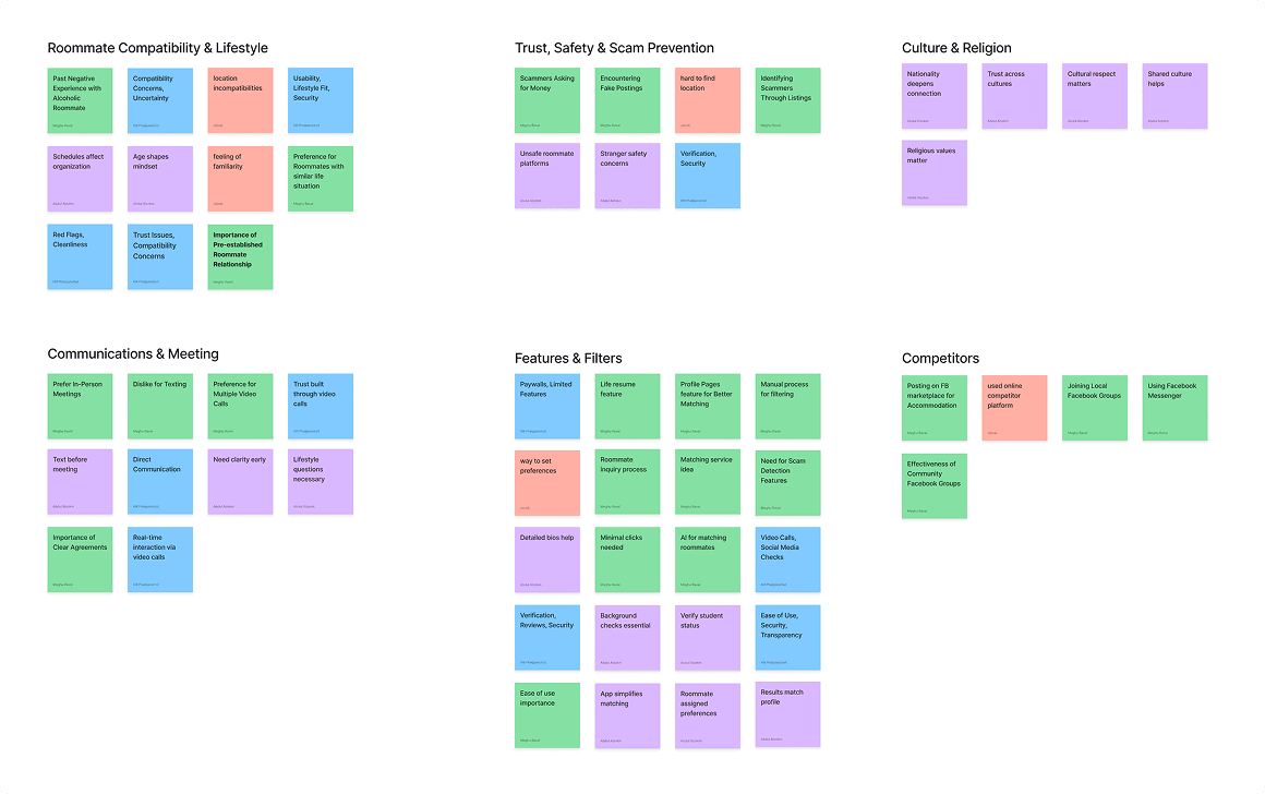
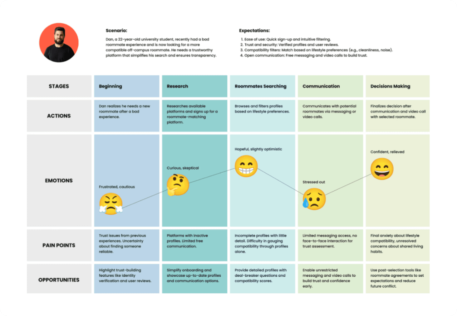
Walking in Dan's shoes
Dan's journey is what most users go through: cautious, curious and unsure when reaching out. Users question whether they are really compatible, feel skeptical during chats, and get overwhelmed by unclear communication. The early search phase is where the trust problem lives.
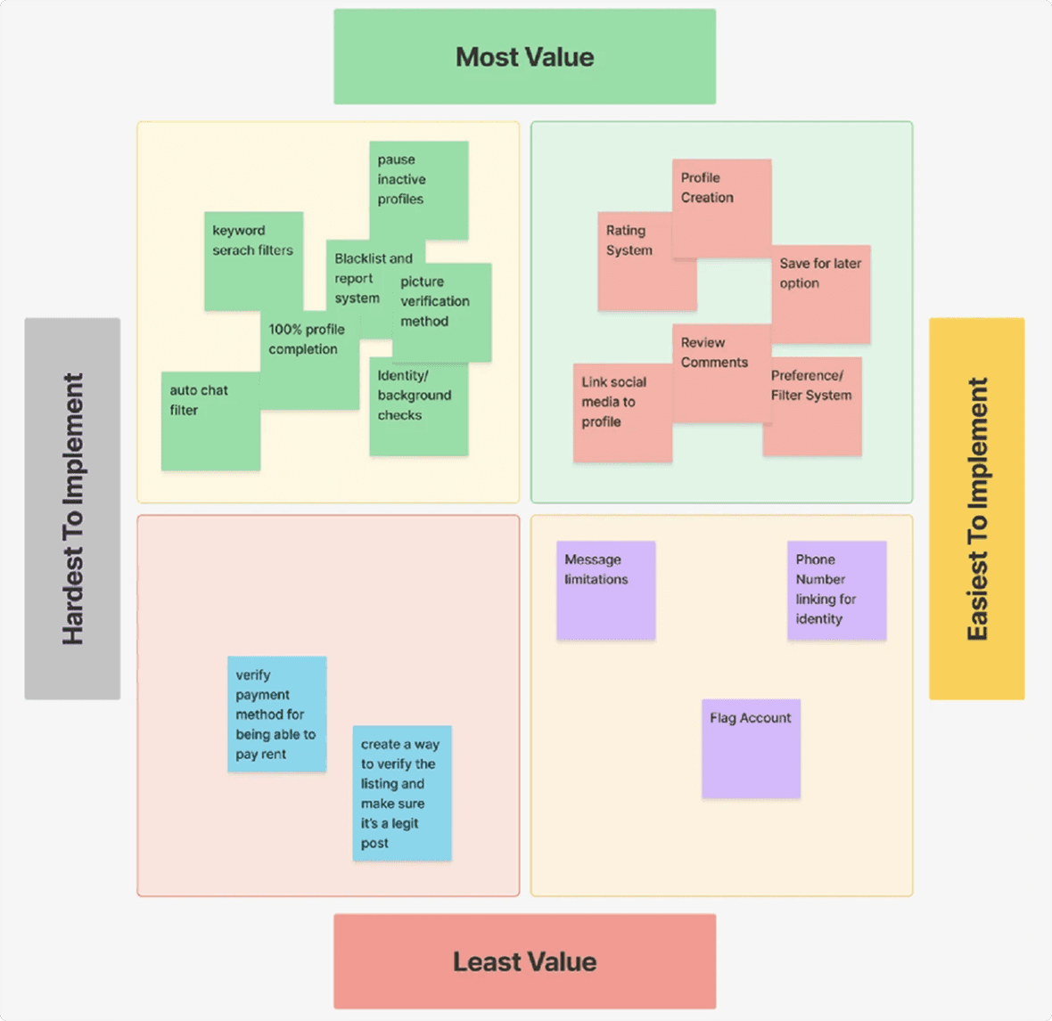
Four features, one trust problem
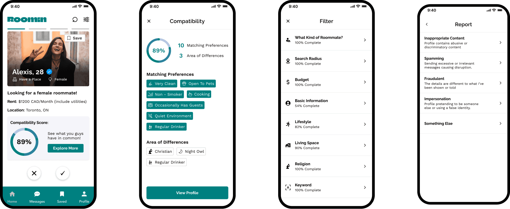
From anxious searching to confident choosing: show compatibility upfront, share real experiences from past roommates, enable lifestyle based filtering, and give users a way to flag suspicious profiles.
Compatibility score
Helps users understand how well they align before they commit. No guesswork, just clear expectations up front.
Detailed filter system
Match on what matters day to day: sleep schedule, cleaning, guests, pets, religion and more.
Real roommate reviews
Profiles are one side of the story. Reviews from people who actually lived with someone reveal what a bio cannot.
Report system
A quiet way to flag what feels off, without confrontation, so patterns can be acted on.
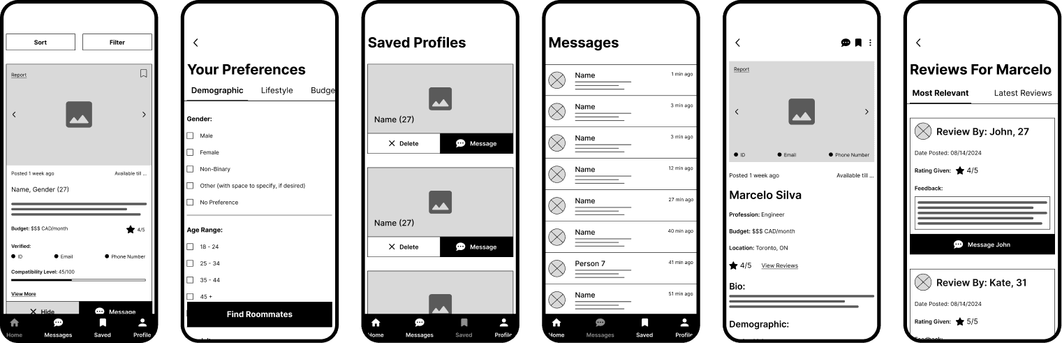
Wireframing the flow
Before any visual design, the four features were laid out as low fidelity screens so the structure could be argued with while it was still cheap to change. Six screens covered the path end to end: browsing a listing, setting preferences, saved profiles, messages, a full profile and its reviews.
Greyboxing on purpose. With no colour, imagery or type hierarchy to react to, testing sessions stayed on what the screens were actually for rather than how they looked.
Reading the wireframes back
Five second tests, journey tests and expert review, across two rounds, run against the wireframes above. Each finding below is paired with the screen that produced it and the change it forced.
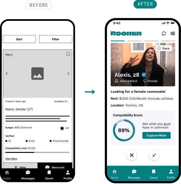
01 · 5 second test
The home page was doing too much
Four of five participants found the homepage overwhelming and hard to navigate in a five second test.
What changed
The home screen was cut back to rent, location and a short bio, so the card carries only what someone needs to decide whether to look further.
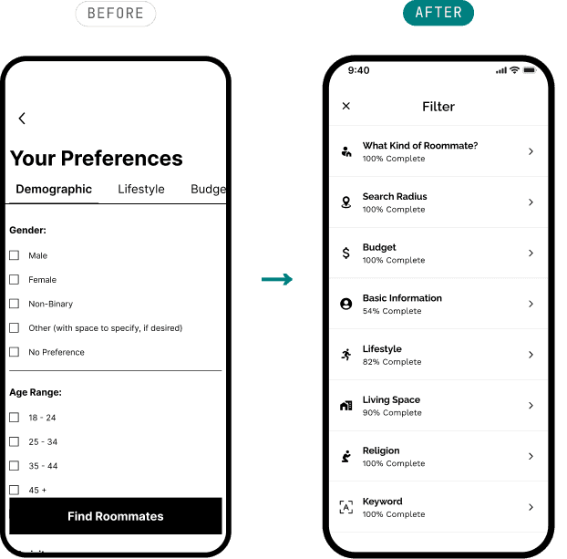
02 · User journey
Filters people would actually use
Three of five felt overwhelmed by the number of filters and skipped them entirely, which defeated the point of building them.
What changed
Filters are collapsed by default with progressive disclosure, so users expand only what is relevant to them.
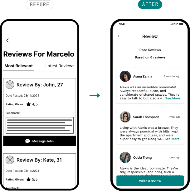
03 · Expert review
Ratings out, reviews in
Two of three industry experts said the rating system could create bias and add complexity, which made us question whether ratings supported a fair experience at all.
What changed
The star rating was removed and written reviews kept. Reviews carry the nuance a single number flattens.
04 · User journey
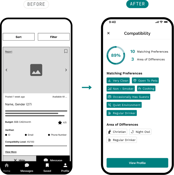
A score nobody understood
Five of five did not understand how the compatibility score was calculated or what it meant. Without context the feature lost its value.
What changed
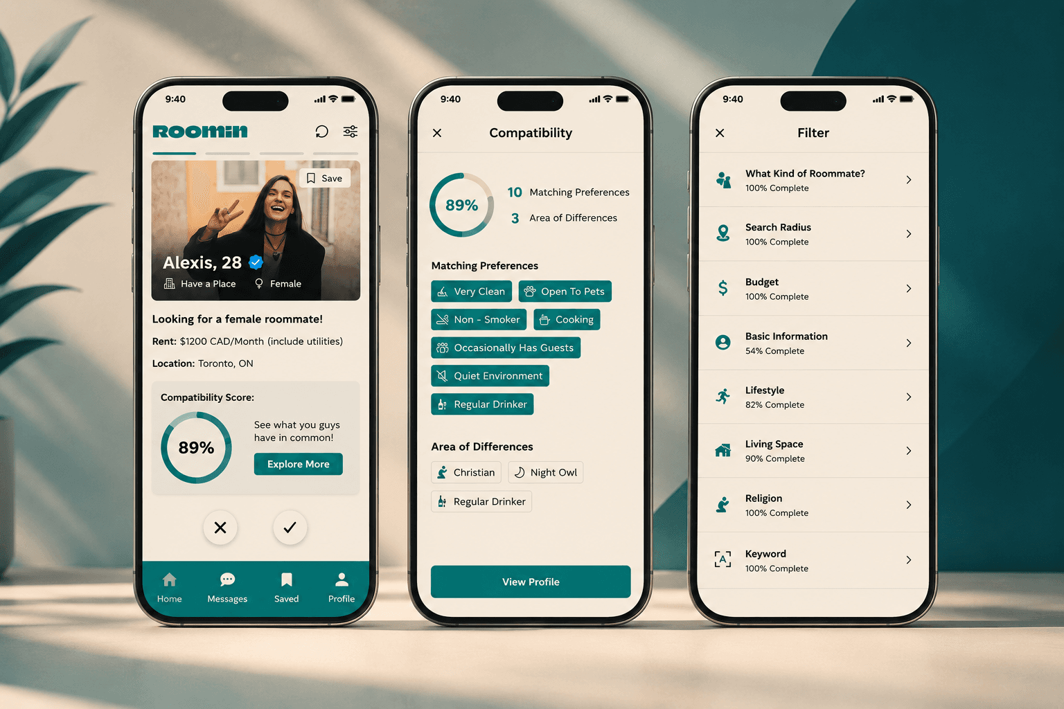
The score was enlarged and paired with an Explore More view breaking out matching preferences and areas of difference, so the number shows its work.
Did it fix the trust problem?
This is the first time I'd actually feel comfortable messaging someone before meeting them. The score and the reviews are doing a lot of work.
The quote above is from a usability participant in the final round.
Browse
1 of 8
Results
- said the compatibility score made deciding easier
- 6/6
- rated the redesign trustworthy in final testing, the same share who arrived anxious about trust
- 87%
- trust and transparency goals validated by experts
- 5/6
- major iterations driven by testing
- 4
Team project across four months. These are outcomes from usability testing and expert review, not live product metrics.
What trust taught us about design
Trust is the silent feature. Every design decision either earns it or spends it.
Numbers without context are theatre. 89% meant nothing until users could tap it open.
Show the differences, not just the similarities. Trust grows when an interface is honest about misfit rather than hiding it.
The brief is rarely the problem. Find a roommate was framed as housing, but the design problem was always trust.
One gap worth naming: three of the four features were tested, but the report flow was built and never put in front of anyone. It is the least evidenced thing in the study and the first thing I would test next.
Beyond that: a deeper verification process going past email and phone into ID and reference checks, smarter filters driven by behaviour data, and more usability rounds on the final design.