WestJet
Booking a flight when you barely fly
A two-round usability redesign of WestJet's flight search and checkout, built for people who book once or twice a year.
- Role
- Prototype build, heuristic evaluation methodology and analysis, usability testing
- Team
- Abdul Alzokm, Anam Malik, Jacob Marquez, Maecel Enriquez, Tina Siassi
- Timeline
- 4 months
- Tools
- Figma, Microsoft Teams
- Context
- INF2171, Master of Information (UX), University of Toronto
The short version
The problem
The live flow buries pricing, splits attention across competing calls to action, and gives an infrequent flyer no way to change a flight without starting the search over.
What I did
I built the first flight selection flow in Figma and contributed to the rest of the prototype. I ran interviews, usability sessions and heuristic evaluations.
- 5/5
Search for a round-trip flight
- 5/5
Compare fare options
- 5/5
Complete booking and checkout
- 3/5Partial
Modify a previous selection
Built for people who don't book often
Booking is where most of WestJet's customer relationships start and end, so the flow carries the whole first impression of the brand.
We designed for infrequent flyers: people who are not fluent in fare breakdowns or airline jargon. Someone who books once a year has no muscle memory to fall back on, so every unclear label and every hidden fee costs them real effort.
Two flows were in scope. Search and selection, then booking and checkout. Four goals held across both:
- Find and compare flights with confidence
- Understand pricing before purchase
- Navigate checkout with ease
- Modify a flight without restarting
The live flow works against the person using it
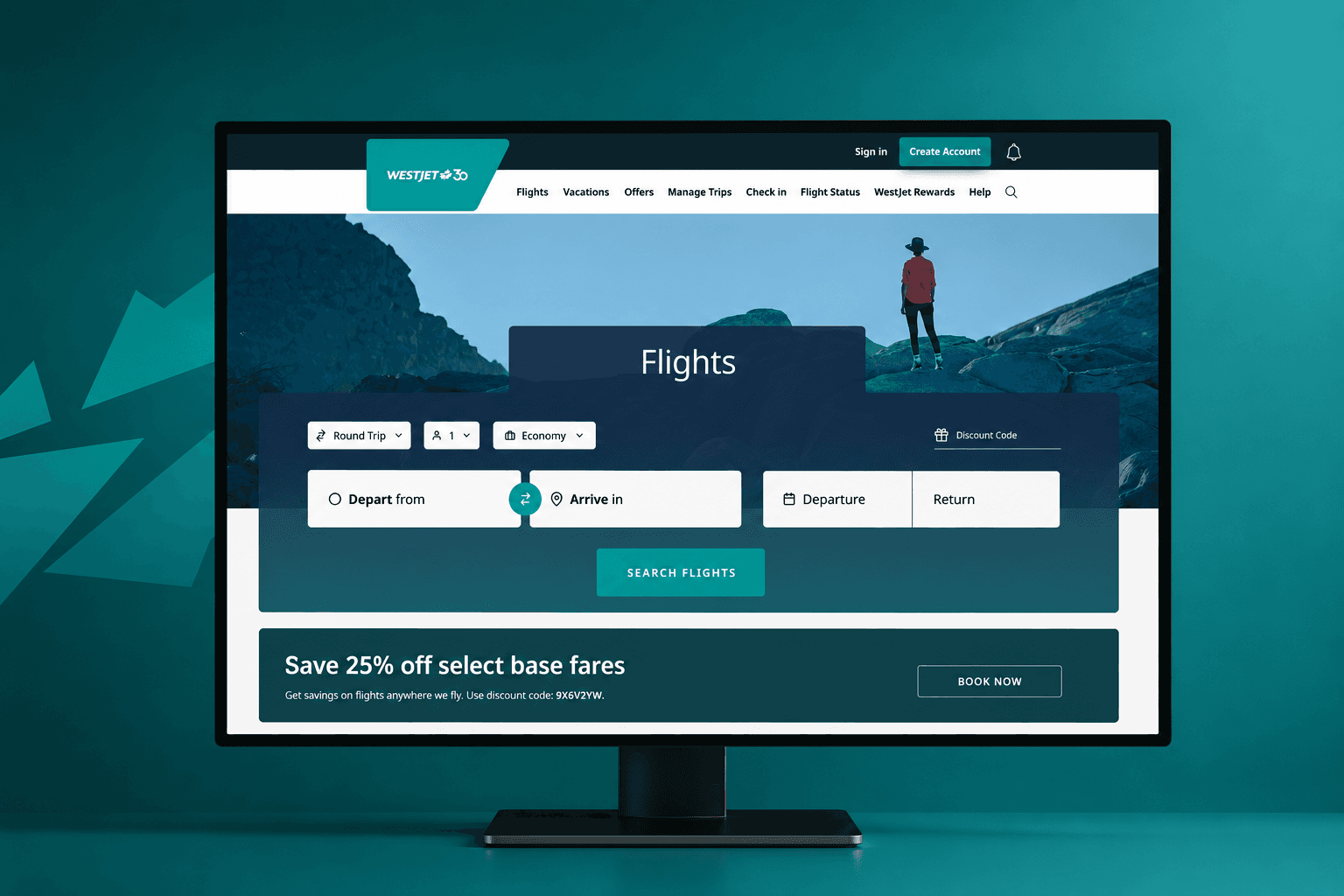
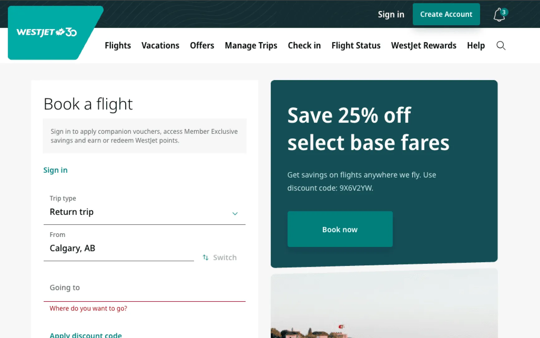
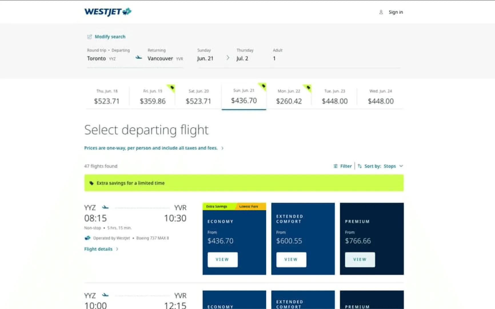
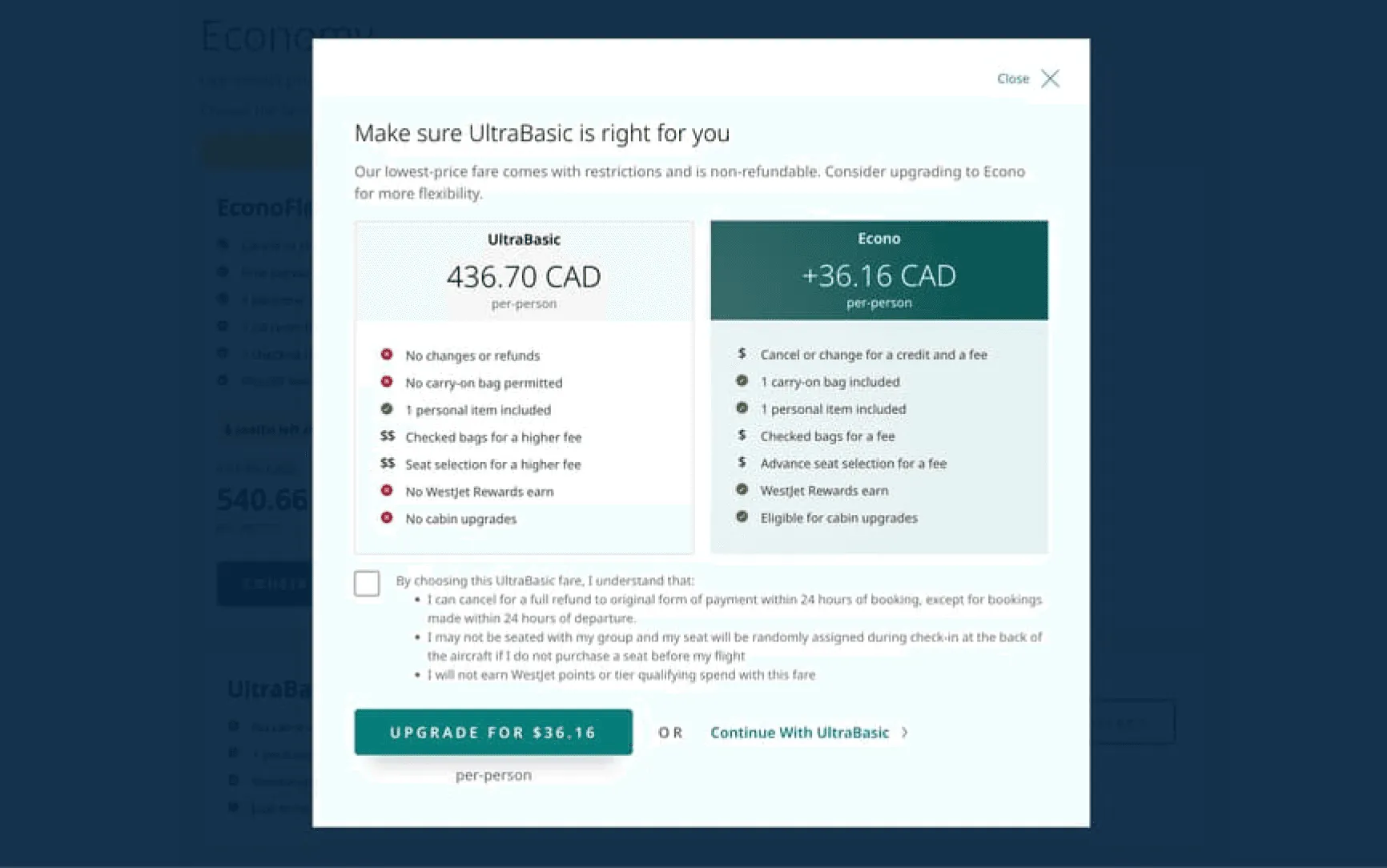
We assessed the live site against Nielsen's heuristics and Norman's design principles. Pricing is buried. Error styling fires before anyone has typed. Attention splits across competing calls to action. Fare types nest in a structure that is hard to compare, and there is no way to change a flight without starting over.
Two rounds, not one
- 01
Heuristic evaluation
The live site assessed against Nielsen's heuristics and Norman's principles.
- 02
First redesign
Both flows rebuilt in Figma against the violations that surfaced.
- 03
Usability testing
Five infrequent flyers, four tasks, think-aloud, moderated over MS Teams.
- 04
Second redesign
Three findings from the sessions turned into three specific changes.
Round one: ten problems, ten decisions
Ten problems were documented across the two flows. The four with the largest effect on the flow:
One action, not three
Before
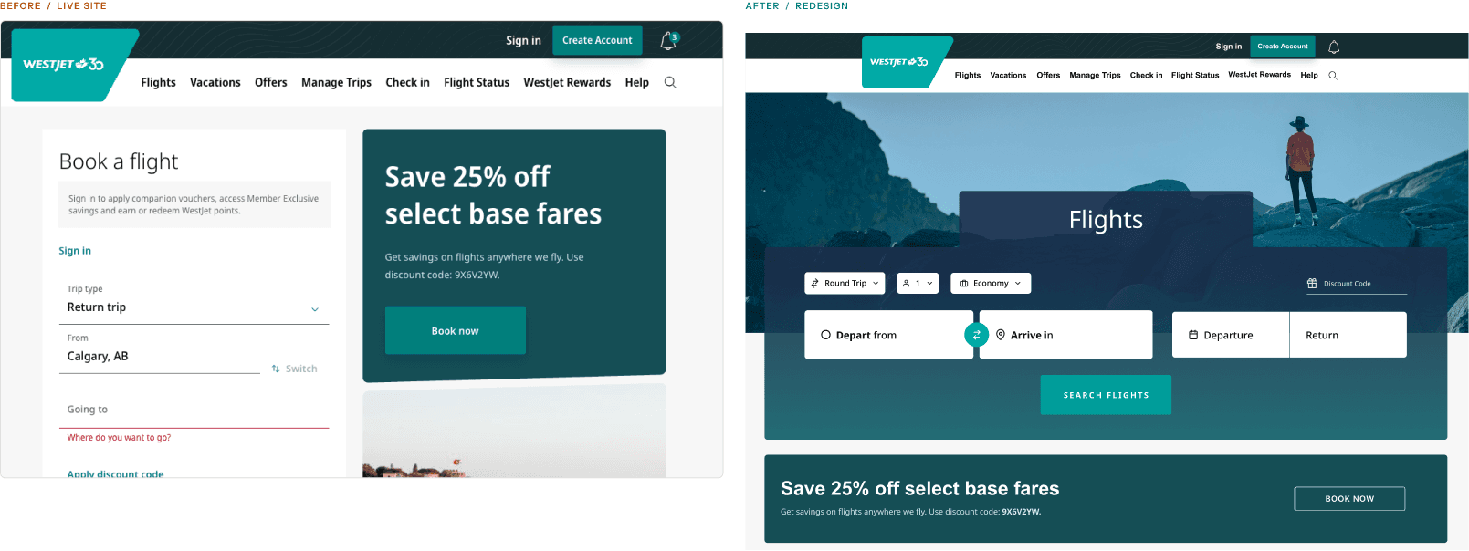
The landing page split attention across the search container, a promotional offer and a hero image. The search box, the whole point of the page, was the narrowest thing on it.
After
A single primary action anchors the page. The label changed from Get Flights to Search Flights, because searching is what the button does and get implied a purchase. Validation only fires once someone has touched a field.
Stop making people remember their departure date
Before
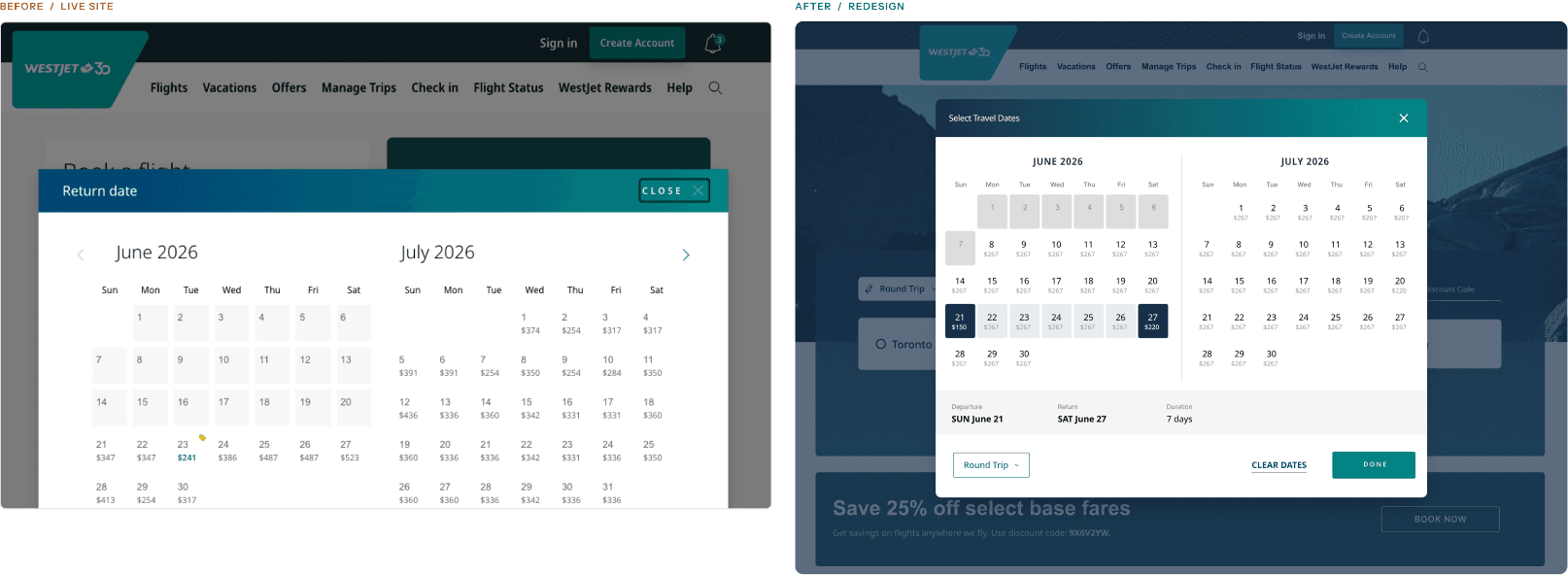
Picking a return date meant holding the departure date in your head. Disabled dates sat at a contrast too low to read as a rule, and there was no way to see how long the trip would be.
After
A summary bar under the calendar shows departure, return and duration. Hovering a return date previews the full range, so trip length is visible instead of calculated.
Five ranked options instead of endless scroll
Before
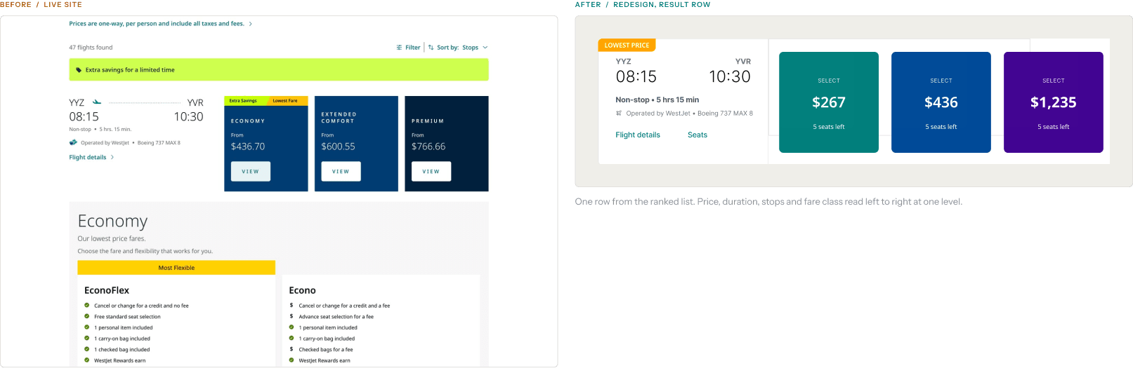
Results ran to dozens of flights with no ranking, and the same extra savings message appeared three times in close proximity: a banner, a date-cell tag and a mini banner on the fare card.
After
Results open under Top Departing Flights: five options ranked on price and convenience, with Show all for the rest. The three savings treatments collapsed into one Lowest Price tag.
Show the total, and where you are
Before
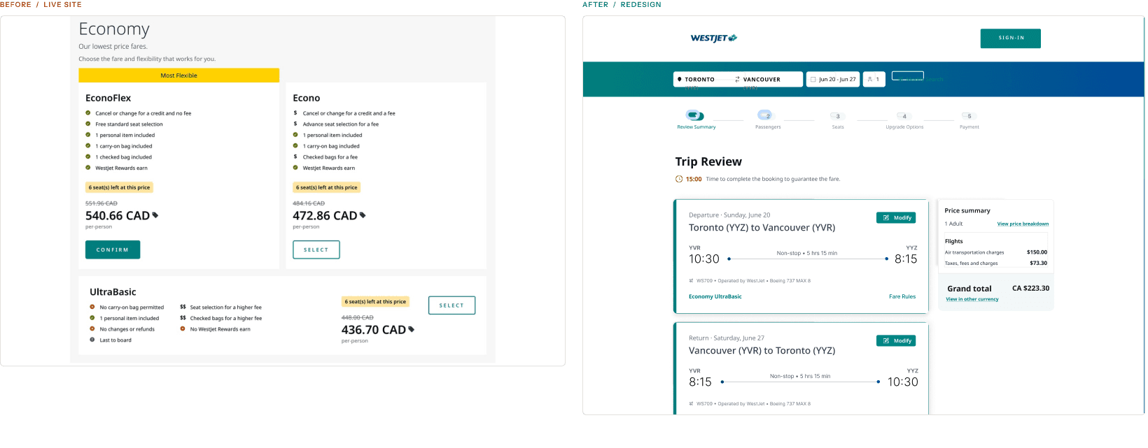
The total sat alone in a corner with no breakdown, choosing the cheapest fare triggered a modal arguing against it, and nothing told you where you were in the process.
After
The summary opens with a stepper. Fees break out alongside the grand total, cancellation coverage is an explicit choice rather than fine print, and a 15 minute timer shows how long the fare is held.
Six smaller changes
Discount code moved to checkout
It sat between the route fields and the dates, interrupting the core search inputs with a step users expect much later.
The loading screen says something
It read as an empty state. It now carries a status message, a progress bar and a summary of the trip being searched.
Fare types flattened
Class first, then fare type inside it, was two layers too many. Fares are now parallel cards showing name, price and features side by side.
A consistent three column grid
Tiles used to change shape row to row, implying that bigger meant different. Unavailable fares now show as a labelled Not Available tile instead of vanishing.
Modify without backing out
Changing a flight meant stepping back through every page of the search. A Modify your flight control now opens the search fields in place.
Guest and member side by side
Continue as Member and Continue as Guest now sit together, instead of pushing guests through an interstitial.
Round two: putting the prototype in front of people
Moderated sessions of about 20 minutes over MS Teams, think-aloud protocol. Screening criteria were 18 or older, flying three times a year or fewer, and having booked a flight in the last 12 months. Notes went into a shared spreadsheet and were anonymized before synthesis.
In a five second impression test, every participant recognized the booking page, the input fields and the primary action.
Flight evaluation
What changed
Sorting became consistent across departure and return. Filter and sort controls gained visual weight, sort options gained helper text, and information density on the results page came down.
What we saw
Three of five wanted results sorted more clearly and more consistently. Telling the departure list from the return list was harder than it should have been, and the cheapest option was not always first.
“Selecting my return flight, it didn't put the lowest option at the top, it was the second option. Lowest goes in the top to begin with.”
Participant 4
“I think typically price is probably top priority.”
Participant 5
Modifying a flight
What changed
Modify your flights moved onto the summary itself and opens an overlay with the search fields in place. A confirmation modal warns that changing dates removes the current price lock, so the tradeoff is visible before committing.
What we saw
Three of five struggled to find how to change a flight, and four of five were frustrated by the idea of restarting the search. This was the one task that did not reach full success.
“If it was more like visible, how to change the flight dates without restarting, then it would have been easier.”
Participant 3
“I wouldn't say it was intuitive.”
Participant 2
Checkout navigation
What changed
Back navigation between steps, with selections preserved when moving backward. The progress stepper carries through every screen, and Back and Skip Seat Selection are explicit controls rather than implied ones.
What we saw
Four of five had trouble moving back and forth to change information during checkout. They completed the task, but they did it without feeling in control of it.
“I would try to go back, like, all the way. Oh, I guess I can't.”
Participant 3
“Unless I wanted to change something, like pick a new flight entirely, I don't see why I have to restart.”
Participant 5
The redesigned flows
Both flows, walked end to end after the second round.
Flow 1: search and selection
Flow 2: booking and checkout
What I would do next
Modify was the only task that did not reach full success, at three of five. The second redesign put the control on the summary and added a price lock warning, but that fix has not been tested. It is the first thing I would put in front of users if this continued.
The heuristic evaluation caught real problems, but it could not have told us that people would not find the modify control. Only watching someone look for it did that. Every round surfaces something the last one could not.